BIG DIPPER FOODS
BRANDING
PACKAGING
IDENTITY
ILLUSTRATION
BACKGROUND
Founded by a mother named Claire Hoyt-Bastien, Big Dipper Foods mission was to provide babies with the best sourced, highest quality nutrient dense foods and at the same time expand babies’ developing flavor palette.
ASSESSMENT
The old packaging was whimsical but recessive on shelf. Big Dipper’s premium baby food utilized HPP technology to retain the vital nutrients, and needed to clearly stand out from the competition as a better and more caring way to nourish your baby.
SOLUTION
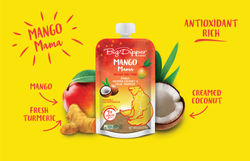
JAM evolved the brand by moving away from the original dull blue packs to a vibrant color palette. The new Big Dipper logo was also combined with the bear and star constellation, on the packaging, to build on the brand story and create a caring and nurturing image that would appeal to both mothers and babies.
 |  |  |  |  |
|---|---|---|---|---|
 |
